WATCH MY EVALUATION
Tuesday, 3 May 2016
Monday, 2 May 2016
Sunday, 1 May 2016
My Double Page Spread Article 1/5/16
Having a difficult childhood growing up on the streets of Newcastle, Clayton was inspired by his haunting past to produce music representative of his youth. Being given the opportunity to DJ at local clubs with thanks to family relations, Clayton decided to take that one extra step and look for a record label. He began by putting his music mixes on Youtube and within a matter of days, he had became the next musical sensation.
With almost 10 years of DJ experience, Clayton James has taken his house and garage music expertise to another dimension with an album that will rival the likes of Messrs Guetta and Garrix. Now he talks to Native about his journey to fame and his hopes for the future.
With almost 10 years of DJ experience, Clayton James has taken his house and garage music expertise to another dimension with an album that will rival the likes of Messrs Guetta and Garrix. Now he talks to Native about his journey to fame and his hopes for the future.
Do you think your childhood has helped you to grow as a person and become the talented DJ you are today?
“Yes definitely, I’m a much stronger person now and have learned not to expect the best in life so now that I'm receiving all this fame, I just cant believe it, I am so lucky!”
Have you always had an ear of music?
“I have, ever since I was little. I'm not the best of singers but I am good at keeping rhythm and as a DJ I pride myself on creating music mixes that have a unique beat and just make people want to dance.”
Did you enjoy creating your new album, Semi-Detached?
“Yes, I absolutely loved it. I have to say that one of my favourite parts was thinking of names for the songs and of course the album title. I've always loved puns so having ‘Semi-Detached’ plays on the idea of both ‘House music’ and the fact that I still find my life so surreal and I haven’t yet adjusted to the fame.”
Why did you choose to focus on house music as a DJ?
“House music has always been my passion, ever since I heard it I just couldn't get enough of it. It is just so different and the funky beat and drops are my favourite.”
Who gave you your inspiration and is there anyone you look up to?
“I have always been a fan of Craig David as cheesy as it sounds but he has inspired me since I was a little boy after seeing him live. I also have so much love for 99 Souls. I look up to my friends, family and fans because without them I wouldn't be able to inspire through people with my music.”
Where do you see yourself in 5 years?
“I’d like to think that the only way is up. I want to continue to push myself and create new music and hopefully bring more albums out along the way. I would also like to tour the UK because that has always been my dream.”
What advice would you give to youngsters hoping to start a DJ career?
“Just don’t give up. Continue to improve yourself as both a person and a DJ because ultimately it is your image and personality as well as your music that will take you all the way”
Progress of Final Cut Double Page Spread 1/5/16
The image below shows the adaptations I have made to my double page spread once I had received all of my feedback. As you can see I have strengthened the brand identity by carrying through the colour scheme and arrow designs. At my feedback stage, my target audience enjoyed the title of the story and the layout so therefore I have decided to keep it the same.
I have introduced drop capitals as they were a popular convention in many magazines I had analysed- 'CJ' standing for Clayton James looks effective as the letters look like a reflection of one another. I have changed the fonts so that my brand identity is continued from the front cover as I initially didn't include the 'Native Alien' font on this page. Overall, I am extremely happy with the progress I have made.
Saturday, 30 April 2016
Progress of Final Cut Contents Page 30/4/16
The image below shows clearly how I have altered my contents page after receiving all of my feedback. I decided to keep the layout the same as that in my rough cut as it received many positive comments during the feedback stage. I have carried through the arrow head design as this will help to strengthen my brand identity. It looks very modern and stylish and also links to the music genre. Additionally, I decided to section the individual stories as I had negative comments about the readability of the text. I did this my placing the headers in a black text box and colouring the writing white.
I decided to swap the social media logo image as I wanted more available sites for my audience to follow the magazine on (6 as opposed to 4). Furthermore, I kept the dotted black line separation bars as I think this looks very effective and visually satisfying. With regards to the layout of this page, I have ensured that once I insert my image, none of the text will overlap the photo. This will make the page look more professional overall.
Progress of Final Cut Front Cover 30/4/16
As you can see here, I have altered my front cover after receiving all of my feedback. I decided to make the most important features stand out on the page by colouring them in the vivid orange colour my target audience helped me design. In this case, the banner, 'Who:', '20' and 'semi-detached' features are displayed in this bright shade. Additionally, I decided to keep the same fonts as they received positive comments during the feedback stage due to their unique and striking appearance.
I decided to keep the arrow head patterns black as this would help to draw more attention to the name of the magazine. Furthermore, I reduced the sizes of my fonts so that the text wouldn't overlap the image. This would look more professional as the text would be easier to read in general. My favourite features on this page are the plus sign and banner as they are very creative, bold and eye-catching.
With regards to the layout of this page, compared to my rough cut version I decided to place the price, issue number and website details next to the bar code as this was a more common convention. In addition to this, I placed the text that quotes: 'The Uk's number 1 house and garage music magazine' above the banner as previously, it wasn't recognisable against Clayton' dark hair.
Friday, 29 April 2016
My Chosen Final Cut Double Page Spread Images 29/4/16
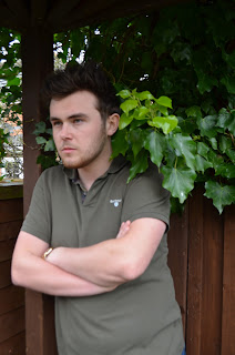
With the help of my target audience, I finally came to the consensus on what images to use on my double page spread. Like I stated in my previous blog, I really liked the images of Clayton with his arms crossed and looking away from the camera so I was happy when my target audience chose this to be my main image. I believe this photo would be the most suitable as it suits the genre of my magazine. This image wasn't taken in-studio so there was a lack of lighting and therefore a shadow was created the size of Clayton's head. I shall manipulate this before placing it on the page to make it look more professional.
For the small accompanying image, my target audience chose a very serious shout of Clayton looking rather aggressively off camera. In the majority of the photos I have taken of Clayton he is looking off camera but this is a very common convention in existing products and suits the genre of my magazine. As this photo was taken in natural daylight, it won't need as much manipulating as the colours are bright and bold. Here are the final images:
For the small accompanying image, my target audience chose a very serious shout of Clayton looking rather aggressively off camera. In the majority of the photos I have taken of Clayton he is looking off camera but this is a very common convention in existing products and suits the genre of my magazine. As this photo was taken in natural daylight, it won't need as much manipulating as the colours are bright and bold. Here are the final images:
 |
| Main image after manipulation |
 |
| Main image before manipulation |
 |
| Accompanying image before manipulation |
 |
| Accompanying image after manipulation |
Thursday, 28 April 2016
Final Cut Double Page Spread Photoshoot 28/4/16
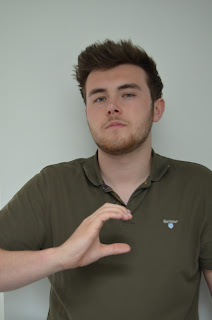
Here are the photos that I took on my final Photoshoot with 'Clayton James'. I wanted a very striking and prominent image for my double page spread- preferably one that would take up the entirety of the right hand page. For my main image, I wanted to take the images against a plain white wall as this was a common convention in the majority of magazines I analysed. For my smaller accompanying photo, I wanted to take it in an outdoors location as the majority of the Clayton James images have been taken indoors. Furthermore, I kept Clayton's outfit the same as it was on the front cover so that my magazine has a sense of continuity.
The images below show a range of different shots from a variety of angles and distances. In order to make the photos more creative, I asked Clayton to pull a variety of different facial expressions from serious to pouty so that I could question my audience on which 2 images they liked best. I really like the images where Clayton is crossing his arms and looking away from the camera as they connote power and could link to his iconic presence within the music industry.
 |
| Main page images (above) |
 |
| Smaller accompanying photos (above) |
Wednesday, 27 April 2016
Creating an Identity for my Artists 27/4/16
In order to add a more personal touch to my contents page, I would like to introduce the idea of having a cluster of polaroid images with the signature and photo of some of the artists featured in the magazine. This could be used as a memento for any fans of the artists as they will be able to cut them out and act as if they have an autograph of their favourite DJ's and singers. I haven't seen this convention on any of the magazines I have analysed so therefore I am challenging a style rule.
I have decided to use the signatures and images of 'Clayton James' and 'Kelly Kings'. When I size these polaroids and position them on the page, I would like Clayton's photo to be larger and more prominent as after all, he is this issues cover artist. In order to get a realistic signature onto the page in digital form, I decided to create a few signatures that could be scanned in and used on my finished product, here are my signature designs:
I have decided to use the signatures and images of 'Clayton James' and 'Kelly Kings'. When I size these polaroids and position them on the page, I would like Clayton's photo to be larger and more prominent as after all, he is this issues cover artist. In order to get a realistic signature onto the page in digital form, I decided to create a few signatures that could be scanned in and used on my finished product, here are my signature designs:
 |
| Clayton James Signature Ideas |
 |
| Kelly Kings Signature Ideas |
Tuesday, 26 April 2016
My Chosen Final Cut Contents Image 26/4/16
I finally came to the consensus of what image I should use on my contents page with the help of my target audience. All along, one image stood out to me so I was very pleased when my target audience agreed that this would be the most suitable. This image was taken at Whitley Bay Skate Park- a very edgy location which suits the genre of my magazine perfectly. Furthermore, this example of mise-en-scene is very striking due to the graffiti which you can see in the distance.
On the Photoshop programme, I used the essentials bar to alter my photo in order to make the colours brighter and bolder. In addition to this, as it was a relatively windy day, the models' hair was blown all over the place. I therefore used the clone stamp tool to clone sections of the sky and clouds to fill in any areas where their hair was too messy. I think that on my final contents page, I shall flip the image horizontally so that the image is on the right hand side of the page. This is a common feature in Mojo and NME magazines so I would like to use this convention in Native.
 |
| Image Before Manipulation |
 |
| Image After Manipulation |
On the Photoshop programme, I used the essentials bar to alter my photo in order to make the colours brighter and bolder. In addition to this, as it was a relatively windy day, the models' hair was blown all over the place. I therefore used the clone stamp tool to clone sections of the sky and clouds to fill in any areas where their hair was too messy. I think that on my final contents page, I shall flip the image horizontally so that the image is on the right hand side of the page. This is a common feature in Mojo and NME magazines so I would like to use this convention in Native.
Monday, 25 April 2016
Choosing my Contents Page Image 25/4/16
As I took so many images on my photoshoot with 'The Treble', I decided ask my target audience which photo they thought would be most suitable. I chose the images that were in focus, well framed, followed the rule of thirds and were bright and colourful. My target audience agreed that the 8 images that are displayed bellow are the most effective and should be considered as my main contents page photo.
After concluding on a small group of images, I decided to individually Photoshop each image so that I could see which one would look most stylish and suitable in its finished state. I mainly played around with the sharpness, brightness, level of contrast and clone stamp tool to create visually spectacular photos. Personally, I like the 4th image down due to the variation in levels, serious facial expressions and vivid colours.
Wednesday, 20 April 2016
Final Cut Contents Page Photoshoot 20/4/16
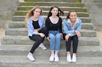
Here are the photos that I took on my photoshoot with girl group 'The Treble'. I wanted a very effective and striking image for my contents page- preferably one that would take up the entirety of the page. I also wanted to have a unique, outdoors location for the photo as the majority of the photos I had taken of Clayton were indoors. Furthermore, I asked the females to wear clothing that consisted of blue denims and blacks as I thought this would look appealing if they matched.
As you can see from the images below, I took a range of different shots from a variety of angles and distances. I believe this makes the photos look more creative and exciting and there is more of a story behind the image. I asked the girls to pull a variety of different facial expressions from serious to smiley so that I could as my target audience which they thought looked best. In my opinion, I think that an image that contains a lot of different levels and colours would look best on my contents page.
Subscribe to:
Comments (Atom)


