Monday, 29 February 2016

5th Double Page Spread Analysis: Mojo 29/2/16

After previously analysing a contents page from a Mojo magazine, it is clear to see that this particular music magazine remains very stylish and professional throughout the entirety of the magazine. It has a strong brand identity and there are multiple conventions that this double page spread follows to which I shall investigate.


With regards to the layout, the image takes up the entire bottom half of the double-page spread. The article is then displayed above- alongside some drop quotes and the headline. By doing this, the reader is drawn to the image due to the sheer size of it and the fact that there is minimal writing to distract from the striking and humorous shot. The text is in three aligned columns which look neat, clear and effective. The headline is extremely large and covers both pages and is coloured in bright yellow to immediately draw the readers attention. 

The image is a medium close up of all four members from the rock band 'The Damned'. The main image is possibly the most important part of the double-page spread due to its size and relation to one of the bands most famous albums. The photography is quite similar to the photo on the cover of their album 'Damned Damned Damned' which is a very effective convention as it also helps to promote their music. It is clear that the image has been taken in a photo studio as there is established light on the artists and a clean dark background. The use of mise-en-scene is very effective as the pies add a humorous vibe and represent the teenagers as fun and mischievous. 

The artists are dressed in black clothes although our immediate attention is drawn to the member that is second from the right.  His facial expressions are the most striking and visible and the chain with padlock around his neck connotes danger and aggressiveness – linking to the rock genre. Within the article, there are 2 drop capitals. The first one is bigger so navigates the reader where the paragraph starts, and the second one informs about the change in topic. The colour scheme of this page is based around two contrasting colours – black and yellow. The black background is appropriate for the magazine style and the yellow colour captures the attention of the audience because it is bright and bold.

The headline intrigues the reader due to the repetition and question mark that follows the third 'fun'. Additionally, the kicker relates to the punk-rock image because the highlighted yellow text against the black background looks fairly alternative and visually effective. The text of kicker has been rotated and isn't a usual convention in magazines, however the reader can still understand it. The font of the headline and the kicker are the same so that it looks professional and doesn't break up the page. Also, by adding a little arrow at the end of the body text to inform an audience about continuation of the article on the next page, it is ensured that the reader doesn't miss out on the rest of the story. 

For my own double page spread, I would like to follow some of the conventions this one follows. Firstly, I would like to include drop capitals as this informs the reader where the story starts and breaks up the text. I believe that having a creative image should also be one of my main priorities as this is what draws the most attention. Finally, I will also experiment with placing text and images at angles as I think this adds a whole new dimension to the page and makes it more visually enticing overall.

Sunday, 28 February 2016

4th Double Page Spread Analysis: Kerrang 28/2/16

After recently analysing a contents page from Kerrang, it is clear to see that this particular music magazine has a very specific and creative brand identity. It is extremely stylistic and immediately draws your attention. The certain style of this page is followed throughout the entirety of the magazine and there are many conventions to which I shall explore.


With regards to layout, there is a large quote being used as a headline, a logo- presumably belonging to the subjects, an article and a huge image. The article is an interview with popular American alternative rock band 'My Chemical Romance'.The headline is in upper case in a red, italic and non-serif font. Blue lines that are attached to the logo lines above and below the headline fade out and act as a border. 

There is only one photograph of the band. It is a mid-shot and has been taken in high-key lighting to draw attention to the bright colours in their clothing. As opposed to using a greyscale image, the bold and vivid colours the subjects are wearing stand out and contrast with the darkness of the article on the opposite page. The image has clearly been taken in-studio as it has a simple white background which additionally helps to make the colours pop on the page. The photograph is noticeably larger than the article as it takes up more than half of the double-page spread. I believe this is to grab the reader's attention as younger audiences are especially attracted to images compared to text. 

Kerrang has a house style colour scheme of yellow, red, black and white. These colours are very prominent across the double page spread to strengthen the brand identity and make sure the colour scheme flows throughout. There is a fairly grungy tone attached to this double-page spread which links to the type of music the magazine focuses on. The way the band members have been styled and positioned also reflect the genre of music as their rock-star personality shines through they're clothing choices and facial expressions. The band are represented as unique, creative and stylish through this image. 

The interview is not in question and answer format unlike the majority of interview pieces. Instead, it has been written in a descriptive manner and includes numerous quotes from the band members. This style of writing doesn't look as visually attractive as the Q&A format but is still easy for the reader to digest. There is only two columns of text and the writing has been coloured white to stand out against the black text boxes. There is a fairly small amount of writing due to the size of the main image. I believe this reveals the target audience as younger readers will be more attracted shorter interview style pieces. 

For my own double page spread, I would like to follow some of the conventions this one follows. Firstly, I would like to have my spread follow the house style colour scheme of my magazines so that it flows throughout and looks professional. I believe including a drop quote will also look effective and is a key convention in the majority of magazines.  Finally, I will also experiment with putting my main image on the right hand side of the double-page spread as this is what readers will see first if they are just flicking through the magazine. This means that they are perhaps more likely to read the article if they are drawn in by a large, striking image.

3rd Double Page Spread Analysis: Rolling Stone 28/2/16

I have recently analysed the front cover of a Rolling Stone magazine so looking at this contents page, it is visible that this particular music magazine follows a very specific style and has a strong brand identity that flows throughout the entirety of the magazine- especially with regards to colour.  There are multiple conventions that this double page spread follows to which I shall be exploring.


The layout of this page is extremely effective in my opinion. A thick black strip runs across the top of the page containing the headline: ‘GREATEST HIP-HOP SONGS OF ALL TIME’ which although is small, it is immediately noticed due to the white text and prominence of the bold strip. Additionally, the left hand side includes the page number '50', an image of Tupac Shakur (2pac) and a pull quote. On the right hand side, there are six colums and a rectangular box in the middle bottom row. The content on the page is cohesive to the title on the page and there are a few images to help break up the large amount of text.
The main image is a black and white mid shot of late rapper 2pac. This is a very conventional feature of magazines as it draws more attention and in this case suits the house style of The Rolling Stone. In this image, 2pac has bare top half  which reveals his tattoos and shows him wearing a chain with a gun pendant. In my opinion, this is a very stereotypical representation of those in the music industry under the 'rap artist' bracket. The gun chain is perhaps a way of connoting  gun violence as this is a common feature in rap lyrics. Personally, I think this image would be recognised as a negative and stereotypical representation of black culture due to the styling and style of shot.
The pull quote is a very interesting part of the left hand page. The speech marks are enlarged on purpose and almost act as a border for the quote, not only drawing attention but also making it equally as important as the image. In addition to this, on the very bottom hand corner of the image, ‘all eyez on him' is written in very small print. This is very clever as this is the title of one of 2pac's songs and it therefore seems like the magazine have used it as word play to create an effective caption. By using the song title and stating that all eyes are on him enhances his position and iconic name in the music industry.
With regards to the right hand page, each individual column has a song title as its subheading with a description explaining why it is included in the greats list and also some interesting facts and information about the song below it. There is also the number in which they are placed in chronological order from 14 to 19. Both numbers are separated into either red or grey rectangles to go along with the consistent house style that runs throughout the entire magazine. 

The name of the artist and the album it is from are also included so that the reader can listen to these songs in the future. I believe this will make the reader feel a part of the magazine as it’s interactive. Although there is a lot of writing on the page, thin black lines make the page look less cramped and is an effective way to separate the information. The small image of Eazy-E doesn't obstruct the text in any way and looks rather than a clean  and professional. 

For my own double page spread, I would like to follow some of the conventions this one follows. Firstly, I would like to have my spread follow the house style of my magazines so that it looks professional. I will also be including a drop quote as they make the stories more personal. I am going to experiment with the colour of my main image as i believe certain effects can be very effective especially this black and white example. Finally, I will make sure that the layout of my page isn't too cluttered so that all ages would be interested in reading it and not just those in the older generation.  

Saturday, 27 February 2016

2nd Double Page Spread Analysis: Q 27/2/16

After previously analysing a contents page from Q, it is clear to see that this particular music magazine has a very strong brand identity that is followed throughout the entirety of the magazine. There are numerous conventions that this double page spread follows to which I shall investigate.


With regards to the layout of this page, the picture takes up the entire left side whereas the right side is made up of just writing. By doing this, the reader is drawn to the image due to the sheer size of it and the fact that there is minimal writing to distract from the striking shot.  The image is a close up of Jay-Z wearing dark shades along with a trendy yet relaxed outfit. His facial expression is very serious and somewhat moody which is a very stereotypical look for Jay-Z. He may be represented as a determined and focused man due to his stern expression and the fact that he is slightly looking down suggests he is superior in the music industry. 

The header on the right hand side of the double page spread is a very small feature and barely stands out as being the title. It reads: 'The most exciting people music in music: Jay-Z' which suggests he is an iconic member of rap culture and has made a career out of his music. The writing style is very narrow and in a capitalised, serif font that isn't much larger than the text size used for the story below it. This page is keeping to the red house-colour scheme which Q uses throughout all of their magazines. The use of drop capitals including the large, red letter 'L' that covers the whole background on the right hand side look very stylish and effective. They not not only look professional and are a common convention in many magazines but also help to separate large sections of text. 

As the house colour for the majority of Q magazines is red, the outfit background behind the image of Jay-Z contains this colour to suit the trend. Moreover, it could be suggested that as only half of the background is red and the other a pale blue, he is a man with two personalities. Red may connote his serious, work attitude whereas blue is his loving and caring side. In addition, the magazine logo/name is placed in red at the bottom of the left of the right page, to further enhance the identity of the magazine brand and follow the house style through onto the rest of the pages. 

On the left hand side, there is a very large story that is roughly a page long. Although Jay-Z has a fairly young audience, I believe this amount of text would be quite off-putting for a younger reader so therefore think that this particular story is aimed at an older demography. On the same page as the image, there is a small section of writing in a fancy, red font just to the right of Jay-Z's shoulder. It is a quote from the rapper and is being used as a teaser so the reader is encouraged to read the entire story. Additionally, the phrase 'rap radar' is positioned near the artist to reveal to the audience what style of music he is renowned for.

For my own double page spread, I would like to follow some of the conventions this one follows. Firstly, I would like to include one main image and perhaps give it its own page as I believe this looks very effective and immediately draws attention.  I will also be more aware of my story length as I believe this particular one is too long for the target audience of the magazine. Like I have stated previously, I think that quotes make stories more personal so I would definitely like to select a particularly special statement and enlarge it.  Finally, I think that the use of drop capitals is extremely clever and adds a whole new dimension to the page so I would like to incorporate at least one of these features.

Friday, 26 February 2016

1st Double Page Spread Analysis: NME 26/2/16

After previously analysing a front cover and contents page of an NME magazine, it is clear to see that this particular music magazine has a very strong brand identity that is followed throughout the entirety of the magazine. There are multiple conventions that this double page spread follows to which I shall be exploring. 


With regards to the layout of this page, I believe it is very effective in the way that the picture has been given its own page. By doing this, the reader is immediately drawn to the image as it is not only the main focus because of its size but also the styling of the shot. The image is a close up of Graham Coxon wearing his notorious thick-framed glasses along with his classic short fringe, stubble and relaxed outfit. His facial expression is very negative and moody which link to the information in the header on the other page. Additionally, his eyes seem to draw in the reader as the bold fames enhance his dark eyes and add a sense of mystery.

The header on the right hand side of the double page spread is extremely large and takes up over half of the page. The font is very striking and the variation in the colours used and the size of the lettering makes the page more exciting and creative. The words have been separated into either black or grey, this has been done because the colour black stands out on the white background more than the grey writing. The singer is represented as quite inappropriate and perhaps more appealing to the older generation as the language used is fairly unsuitable for younger audiences e.g.‘orgies, vomiting, vicodin’.

As the house colour for the majority of NME magazines is red, the outfit worn by Graham contains this colour to perhaps relate to the magazine as red is the only bright colour on the page. In addition, the magazine logo/name is placed in red at the bottom of the right page, to further enhance the identity of the magazine brand and follow the house style through onto the rest of the pages. 

There is a fairly large amount of writing placed on the double page spread below the header. I believe this reveals the target audience as younger readers would be less attracted to a story if there is a lot of writing. On the other hand, I believe that the amount and style of writing is aimed at older generations as younger people would perhaps prefer a short interview piece.  Moreover, the drop capital 'G' about half way through the story helps to split up the writing and adds more excitement to the lower half of the page.

For my own double page spread, I would like to follow some of the conventions this one follows. Firstly, I would like to include one main image as I believe this looks very effective and is extremely eye-catching. I will also use bold and striking fonts in order to make my header stand out. I particularly like how they have used a quote on the page as I believe it makes it more personal so I would like to include one on my own. Finally, I would like to incorporate a drop capital into my work as I think this is an effective and stylish way to break up text and make it appear less cluttered.

Thursday, 25 February 2016

5th Contents Analysis: Mojo 25/2/16

Mojo is a popular music magazine that was first published in 1993. It publishes monthly in the United Kingdom and has a large age demographic due to the large variety of musicians and singers that the genre covers. Although this contents page is dated back to 2011, it is simple yet effective with particular conventions that are still used to this date in the majority of magazines. 


The overall design of this contents page is minimalistic and suits the general house style of the entire magazine. It is also very typical of every issue created by Mojo as the layout, fonts and style of image are always similar to the page shown above. Additionally, a brand identity is created by using the same red, black and white colour scheme and fonts as the magazine becomes recognisable as having that simplistic colour collection and writing style (which is very alike to that of Q magazine)

The only 
image, is a mid-shot of Bert Jansch sitting down with his guitar on his lap. The image is in black and white to suit the rest of the colour scheme. His facial expressions are very serious and the styling is very old-school and trendy suggesting he is a unique character. He is represented as a person who doesn't take things for granted through the use of a quote from Colin Irwin. The quote is in a large and different font to those of the rest of the page making it stand out and therefore draw attention.

The layout is relatively simple and there are different sections to the page. 
There is no overlapping of text and the use of thin lines helps to divide up the page. The bolder font of the stories in the magazine also help the text to stand out as it makes the writing more prominent and eye-catching. The theme of this contents page shows 
a high level of sophistication and the arrangement of the contents page is clean and polished. The red headings and numbers stand out as they are the only coloured things on the page- simplifying finding particular stories for the reader. The text is arranged neatly around the image of Bert Jansch making it very visually pleasing. 

With regards to brand identity, the contents includes the name of the magazine in the top centre of the page- in the same font as that on the front cover. Additionally, by having the 3 main cities where the magazine is most influential beneath the title, it makes it more personal as some readers may be from these areas. Moreover, the magazine company are represented as simplistic and creative due to this effective and minimalist creation.

For my own contents page, I would like to follow some of the conventions this one follows. Firstly, I will include a simplistic colour scheme as not to over complicate the page and distract from the image and text. Additionally, I will ensure that I alternate between fonts including their size and boldness so that it is easy to distinguish between stories
. Finally, I will clearly section the page so that there is minimal overlapping as I believe this is the most effective way to present the information and images.

Wednesday, 24 February 2016

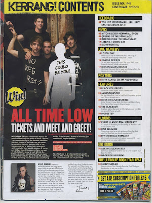
4th Contents Analysis: Kerrang 24/2/16

Kerrang is a UK-based magazine devoted to rock music and was first published in 1981. In the early 2000s it became the best-selling British music magazine and has a very specific brand identity that is included throughout the entirety of the magazine. For this particular contents page, there are multiple conventions that are still used to this day as although this was published in 2013, it still remains stylish, modern and informative. 

Generally, all contents pages that Kerrang create follow a very similar house style, in this case with the use of a bold header, numerous images, repetitive colour scheme and a large variety of text. It isn't as stylistic as previous contents pages I have reviewed but still draws your attention and makes you want to read on. The page doesn't consist of many vivid colours but there are a few bright colours on it to highlight important features. The colour scheme is black, yellow, red and white- with the main colour being  black. The dark colours are stereotypical of the rock genre but the brighter shades make the page more exciting for the reader.

With regards to the image, it is definitely the main feature on this particular contents page due to the size and styling of the shot. Being the largest aspect of the page, it also indicates that it will be the biggest story in the magazine. The full body shot of 'All time Low' is very dark and the members of the band are all dressed in black and have been positioned in a very typical 'boy band' way. The band are represented as laid back yet quite generic as they aren't partaking in any activities that would make them stand out. The white body shape containing the text 'This could be you!' is an example of how personal pronouns can be used to draw attention and make the reader feel included. There are also a lot of plugs around the page so you can see what stories interest you most and then go straight to that page.


The title showing ‘Kerrang! Contents’ is in a very creative and striking font. The letters appear to be smashed which reflects the rock genre as there are often connotations violence through loud music. It is large and bold which makes it very clear to read. The colour black on a yellow background is visible and effective as they contrast immensely. Additionally, by having the name of the magazine repeated on the page, a sense of brand identity is created and reinforces the genre of the magazine as the word 'Kerrang' is an onomatopoeic word that derives from the sound made when playing a power chord on a distorted electric guitar.


Concerning the layout of this contents page, I believe it is very strategic which therefore makes it effective. It is split into roughly 3 sections- image, text and acknowledgements/extras. The image focuses on an important story (a meet and greet with a band), the writing is sectioned into 8 subheadings which contain different stories and there is also a message from the editor and subscription service info. By having sections like this, the page is a lot easier to read and visually pleasing to the eye. In addition to this, it is easier to locate stories and get involved with your desired features. One of the key conventions that this page includes is the issue number and cover date that are a major part of publishing.

For my own contents page, I would like to follow some of the conventions this one follows. Firstly, I would like to include a message from the editor as I believe this is a very personal feature and immediately creates a positive relationship with the the magazine and the reader. Additionally, I will include numerous brand identity features that will help make my magazine more recognisable. Finally, I shall have a very conventional lay out so that it is easy to read yet remains stylish. I believe that if the contents page is effective, it will make readers want to read on.

Tuesday, 23 February 2016

3rd Contents Analysis: Vibe 23/2/16

After analysing the front cover of a Vibe magazine in my cover research process, it is visible that this particular music magazine has created a specific brand identity that they have opted to use throughout the entirety of the magazine. It is clear to see numerous conventions that this contents page follows that are a both a necessity to all contents pages but also to the company in general. Although this specific magazine was published in 2008, it still conforms to modern day techniques and has a range of informative and stylish features.

In general, every contents page created by Vibe follows a very similar style- with the use of a single large image, minimal text and the letter 'V' in the background. In this case, there is no particular colour scheme although the colour maroon is very prominent as it is the background colour and there is two different shades used. This page could be considered as unique as unlike the contents pages from 'Q' and 'NME', there isn't a house colour that is used throughout the magazine. On the other hand, it is extremely stylistic and immediately draws your attention, making you want to read on. 
The main image is definitely the main feature on this particular contents page due to the size and styling of the shot. Additionally, the image reveals the genre of the magazine as the use of gold chains and jewellery worn by the artist connote the wealth and lifestyle those in the hip hop music industry. By styling the rapper in no clothes except for a hat, all our attention is drawn to the bling that the artist models. It could be said that the target audience would therefore be the younger generation as the image may not appeal to the older generation due to the particularly aggressive body language and lack of costume.
The title showing ‘contents’ is in a very simple, white font. It is large and bold which makes it very visible to readers and stands out on the page. The colour white is most visible on darker colours making it very effective. Moreover, the letter 'V' on the background brands the magazine name “Vibe” and has been done to show the importance of the magazine and make it recognisable throughout the entire magazine. The name of the magazine is also printed again in the top right corner of the page in the same font that is used on the cover- further strengthening the identity of the brand. 
The camera angle suggests the rapper is very powerful in the music industry and the fact that he is grabbing and pulling his jewellery with his gold teeth gives us an idea of his personality- perhaps through his music and lyrics. The  image only covers a small part of the title (contents) definitely making it the main focus on this page. With regards to the layout of this contents page, I feel like it is presented very well but lacks structure. The writing to the left of the page looks rather random and doesn't suit the image and the lack of page numbers prevent the reader from locating their desired story easily. 
For my own contents page, I would like to follow some of the conventions this one follows. Firstly, I would like to include a very striking title (contents) as this immediately draws attention and stands out on the page. Additionally, I will include particular features like those used here to help create a brand identity as I believe this is very effective and will help my magazine be recognisable. Finally, I will make sure to date the issue as this is a very common convention used on all contents pages and will add to the branding side of my magazine. 

Sunday, 21 February 2016

2nd Contents Analysis: NME 21/2/16

After previously analysing the front cover of an NME magazine, it is clear to see that this particular music magazine has a very strong brand identity that is followed through onto the contents page. There are multiple conventions that this contents page follows to which I shall be exploring. Although this specific magazine was published in 2009, it is still very up to date and uses a variety of features to keep it stylish yet informative.


The overall design of this contents page is very typical of every issue created by NME and uses a rather common colour scheme of red, black and white. The font for NME is the same throughout the entire magazine which helps with branding and will make the name more recognisable. By having the name of the magazine in red and a font size that is equally as large as the word 'contents', it stands out on the page and comes across as a very important feature. This page fits the genre of this magazine just by using a colour combination like this which (noting from previous investigations) is extremely popular.  
There is only one image on this page which is rather unique for a contents page. I believe this has been done to draw attention to the particular story that it links to, in this case-  'The Arctic Monkeys'. The image is a mid shot of 2 members from the band which immediately intrigues the reader as to what event this may have been making them want to read the story in order to find out. The image is fairly dark which links to the edgy and grungy genre of the magazine as well as helping to section the page nicely. 

The layout is relatively simple and the writing is sectioned off into certain areas through the use of block sectioning and subheadings. There is no overlapping of text and the varying font size and colours help the individual stories and features to stand out as it makes the writing more prominent and eye-catching. It appeals to the target audience by giving snippets of information as opposed to huge sections of writing- there is part of the 'Arctic Monkey Story' which is given as a teaser. There are a series of black arrows on the right hand side of the page which tell the reader if the story was on the cover or not- allowing the reader to ensure they don't miss out on a main feature within the magazine. 

With regards to brand identity, the contents includes a discount code for a subscription to the magazine  as well as a web address for the magazine and a phone number. All the fonts are very repetitive which help construct a sense of branding as we recognise what the pages should look like the more we read on. The magazine company are represented as simplistic, edgy and inventive due to this effective contents page.

For my own contents page, I would like to follow some of the conventions this one follows. Firstly, I would like to include a subscription code as this is a popular convention of a music magazine and will be an added luxury for readers. Additionally, I will use a variety of fonts and have a simplistic colour scheme that will help to create a brand identity. Finally, I will alter the sizes of my fonts so that the reader can clearly distinguish between stories. 

Friday, 19 February 2016

5th Cover Analysis: Mixmag 19/2/16

Mixmag is a British electronic dance and clubbing magazine, published in LondonEngland. Launched in 1982, the magazine covers dance events, reviews music and club nights. It has a demographic of 18-25 year olds and is a successful magazine which has recently found itself as an on-line format.


The main image is of American electro house musician, record producer, and music executive Steve Aoki. The image is a full-body shot of Steve jumping and the rule of thirds is used- placing the most important features in the middle third. Steve's head is in the top middle third and the American flag on his hoodie and shoes are also in the centre third. This has been used to draw our attention to Steve and give us an idea of his background. He has a very playful facial expression which gives the magazine a fun vibe. Additionally, his hand gestures and crazy hair excite the reader as they reflect the dance and clubbing lifestyle. 

Steve is represented as a very unique and edgy artist through the styling, positioning and choice of shot. He comes across very calm and confident which is necessary for DJ's as their image is one of the most important parts of their career as this is what sells their music. The magazine is represented as stylish and modern and by straying from the traditional cover conventions, the younger generation will be more convinced to buy it.

The banner (mixmag) is very striking and prominent in its bold non-serif font and bright white colour. Although some of the banner is being covered by Steve's head, we are still able to recognise what the writing says as the font stands out on the page. The main colour theme is red, white and blue- probably chosen as they represent the colours of the American flag. These colours compliment one another and create a musical background for the artist as he is of American origin. The majority of the text is written in red or white colour as they are most prominent on the background. Some of the writing is sectioned in white, black or red boxes which makes the writing even more eye-catching and clear. 

With regards to lay out, the cover is visually effective and the positioning of the image is very clever as none of the writing overlaps his body other than his name. Steve is the focal point of the cover and his name is in a bold font with and black background which immediately draws your attention. This piece of text is the largest making it the most important feature. The use of a logo in the dot above the 'i' helps with the branding side of the magazine. The turn DJ turntable is easily recognisable and links to the magazine genre. 

For my music magazine, I wish to incorporate some of the conventions this cover follows. Firstly, I would like to have a fairly simple front cover as it is effective and not too over the top with regards to colour and text . Additionally, I shall have the name of my artist as the largest piece of text after the banner as this is the most important feature. I would also like to include a sentence explaining my magazine like the one that is presented on this page- 'The world's biggest dance music and clubbing magazine'. I believe this will immediately draw in attention as it is an impressive fact. Overall, I would be very pleased if my magazine was as well put together and visually attractive as this one.  

Thursday, 18 February 2016

4th Cover Analysis: Vibe 18/2/16

Vibe is an American music and entertainment magazine which was founded in 1993. The publication predominantly features R&B and hip-hop music artists, actors and other entertainers. The magazine's target demographic is predominantly young, urban followers of hip-hop culture.


The main image is a mid-shot of popular Canadian rapper, singer, songwriter, record producer and actor Drake who takes up almost all of the page. He has a very moody and serious facial expression which gives the magazine a masculine and edgy vibe. Additionally, by looking straight ahead his eyes will focus on the reader - encouraging them to buy the magazine. He is positioned directly in the centre of the cover and has a slight head tilt towards the left of the page which gives a more laid-back impression. 

Drake is represented as a very cool and dapper artist through his powerful stance, focused expression and the clever use of styling. Moreover, the headline 'Hip-Hop's New Religion' suggests he is a very influential and renowned character in the Hip Hop industry and is worthy of having an empire of followers and fans.
 He comes across as an extremely confident man through the word 'UNSTOPPABLE' written on his t-shirt, this suggests he knows his powerful position in the music business and isn't afraid to show it. 

The banner (Vibe) is very bold and draws your attention immediately due to its striking non-serif font and bright white colouring against the dark background. Although some of the writing is being covered by Drake's head, it is still clear as to what it says as this font is recognisable and stands out on the page. The main colour theme is yellow, black and white. These colours are very eye-catching and have been cleverly chosen to compliment one another. The background colour is black and specific pieces of text are highlighted in either yellow or white, some information is displayed in a yellow box with the writing being visible against the black colour behind it. 

With regards to lay out, the cover is very visually satisfying as the minimal text and bold image suit the genre of the magazine. Drake is the focal point of the cover so by bordering his head with text our attention is drawn to him. By sectioning parts of the text with colour and boxes, we also focus on the most important stories such as the word 'Exclusive' in a bold yellow text box. Not much of the text overlaps Drake in order to retain the most attention on the his face, however a few words cover his shoulders.

For my music magazine, I wish to incorporate some of the conventions this cover follows. Firstly, I want a minimalistic colour scheme as I believe this looks extremely effective and well suited to the genre. I will also consider positioning my cover artist directly in the centre of the page but may have them looking away from the camera as I believe this is a more chilled and laid-back approach and that is what I am trying to achieve. Finally, sectioning of the text is very pleasing to the eye so I shall therefore try and achieve this effect with my own magazine.

Wednesday, 17 February 2016

3rd Cover Analysis: Tilllate 17/2/16

Tilllate Magazine is a dance music, club culture and lifestyle magazine. Established in Scotland in 1988, it has a demographic of 18-25 year olds and includes fashion stories and artist interviews, club or technology reviews, and coverage of current and predicted trends. It has relationships with brands, labels and clubs worldwide, and many of its staff are established club DJs making it a successful magazine which has recently found itself as an on-line format.


The main image is a mid-shot of Laid Back Luke who takes up almost all of the cover. He has a very playful and cheeky facial expression which gives the magazine a fun and light hearted vibe. Additionally, his hand gestures excite the reader as they reflect the dance and clubbing lifestyle. His colourful T-shirt also stands out and draws in the reader with its yellow to pink ombré pattern.

Luke is represented as a very cool and original artist through his unique and rather unusual styling and actions. Moreover, the headline 'Superstylin' you & me' suggests he is young and edgy as the 'g' dropping is a rather youthful thing to do. The words 'you' and 'me' are examples of personal pronouns and help to draw in the reader and make them feel included. He comes across very confident which is necessary for DJ's as this is how they express their individuality and are able to perform to thousands. The magazine is represented as very up-to-date and  stylish as it doesn't follow traditional conventions and will be appealing to the younger generation due to the bright colours and crazy image.

The banner (Tilllate) is very eye catching in its bold non-serif font and striking black to red gradient colour. Although the majority of the writing is being covered by the main image (we can only see 'tilll'), it will still be recognisable to regular readers as the font stands out on the page. Additionally, if the readers aren't aware of the name of the magazine from looking at the banner, the name is repeated at the bottom of the cover page in a bold yellow font. The main colour theme is red/pink, yellow, black and white with a splash of blue. These colours have been chosen as they stand out individually but still compliment one another. The majority of the text is written in black or white colour as they are most prominent on the background image.

With regards to lay out, the cover is pleasing to the eye and the positioning of the image and text is effective. Luke is the focal point of the cover even though he isn't positioned exactly in the centre of the page- he is slightly to  the right of the cover. The majority of the text overlaps his body as it is a relatively large image and his actions make him even more prominent on the page. The use of a logo helps with the branding side of the magazine as although we can't see the complete banner, the logo should help on a visual level as it is easily recognisable and stands out on the page. There is a small image used in the bottom left corner of the cover which adds extra incitement but doesn't distract you from the main image, it is in a bright blue colour.


For my music magazine, I wish to incorporate some of the conventions this cover follows. Firstly, I would like to include a logo for my magazine as I believe this will help with branding and will be a recognisable feature for my magazine. Additionally, I will make the name of my cover artist the largest piece of text on the front cover as this will draw immediate attention. I also won't be afraid to cover some of my banner with the main  image as it still looks effective but I shall ensure that it is still easily readable as I believe too much of the banner is covered on this particular cover.

Monday, 15 February 2016

2nd Cover Analysis: Rolling Stone 15/2/16

The Rolling Stone is a biweekly magazine that focuses on popular culture and was founded in 1967. It is known for its coverage on youth-oriented television shows, film actors, and new music. The main readership for the magazine is the younger generation of around 16-22 year olds. 


The main image is a mid-shot of popular American rap artist Eminem who takes up almost all of the page. By holding a boom box on his shoulder, the audience are aware of both the magazine's and Eminem's relevance to the music industry as we associate boom boxes with hip-hop tunes etc. He has a very moody and focused facial expression which gives the magazine an edgy and masculine vibe. Additionally, by pointing towards the reader they will feel included and obliged to buy the magazine as it is as if he is pointing to you as an individual.

Eminem is represented as a very cool and unique artist through his powerful stance and the clever use of styling. Moreover, the headline 'Eminem Reborn' suggests he has perhaps taken a break from his music career- coming back better and stronger than ever. He comes across as a fairly confident man because of his positioning which links to the idea of him approaching music at a new angle. 

The banner (Rolling Stone) is very eye catching in its fancy, bold serif font and striking red colour. Although some of the writing is being covered by the main image, it is still clear as this font is recognisable and stands out on the page. The main colour theme is red, black and white. These colours have been chosen as they are individually prominent but still compliment one another. Specific pieces of text are highlighted in these three colours although the most important text is coloured red as this is most eye catching.

With regards to lay out, the cover is very visually satisfying as text is minimal although still informative. Eminem is the focal point of the cover so this is why the text surrounds him with only a few words overlapping his body. The use of thick black lines/blocks helps to section the cover and creates a sense of intrigue. Eminem's hand is larger than his head in the image as this is an important feature that will attract customers.

For my music magazine, I wish to incorporate some of the conventions this cover follows. Firstly I want a colour scheme of 3 colours like this cover as I believe it is minimalistic, effective and well suited to the genre. I will also consider using blocking to help section the text. Finally, the image is very striking and immediately attracts attention because of the artists stance, I shall therefore try and achieve this effect with my own magazine.


Sunday, 14 February 2016

1st Magazine Cover Analysis: NME 14/2/16

This front cover is for the British music journalism magazine NME (New musical Express) which has been published since 1949.  It is mainly associated with indie, rock and alternative music genres.The target market for this magazine is generally based around 16-25 year olds.


The main image is a mid-shot of British indie rock band Foals centred by lead singer and guitarist Yannis Philippakis. This particular music genre is strengthened by the masculine styling and facial expressions of the band. They look rather serious and determined and by looking right into the camera lens they somewhat intimidate the reader. The positioning of the image adds to the rock feel as the bare bones at the front of the image create a strong reference to lifelessness and being stripped back to reality.

They are represented as an original and edgy group who don't follow the social norm. They are proud to be different and take a modern spin on music which is highlighted through the text, 'To make this record, things had to be killed...' which suggests they achieve a sense of power through their ability to create unique music. 


The banner (NME) is quite plain however the bold font and colour attracts our attention. Additionally, the colour red can symbolise danger and accentuates the genre of rock. The name 'Foals' being clear, in a different font and a contrasting colour means that no separate title is needed for the band. The main colour theme for the front cover is white, red, black and yellow. All of these colours stand out individually and suit the font they have been selected to colour. 

With regards to layout, there are also two smaller images in the top right hand corner which help to frame the main image. The smaller images are bright but still don't distract too much attention away from the focal picture. The use of circular text boxes creates a less harsh impression as the lack of sharp and angular edges would perhaps attract too much attention to the less important text.

For my magazine I want to include an image that has connotations of strength and masculinity just like the one used here. This will suit my genre and reflect macho vibes which I desire to produce. Although I will be having an individual on the front as opposed to a band, I still want this to be achieved. The model on the front must also follow the conventions of this genre of music so I shall find someone who is both attractive and suits the 'garage/house' style. The colour scheme will also be very appealing like the one NME has used and the fonts I use must suit the genre as this will make the cover visually enticing.