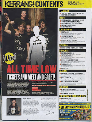
Kerrang is a UK-based magazine devoted to rock music and was first published in 1981. In the early 2000s it became the best-selling British music magazine and has a very specific brand identity that is included throughout the entirety of the magazine. For this particular contents page, there are multiple conventions that are still used to this day as although this was published in 2013, it still remains stylish, modern and informative.
With regards to the image, it is definitely the main feature on this particular contents page due to the size and styling of the shot. Being the largest aspect of the page, it also indicates that it will be the biggest story in the magazine. The full body shot of 'All time Low' is very dark and the members of the band are all dressed in black and have been positioned in a very typical 'boy band' way. The band are represented as laid back yet quite generic as they aren't partaking in any activities that would make them stand out. The white body shape containing the text 'This could be you!' is an example of how personal pronouns can be used to draw attention and make the reader feel included. There are also a lot of plugs around the page so you can see what stories interest you most and then go straight to that page.
The title showing ‘Kerrang! Contents’ is in a very creative and striking font. The letters appear to be smashed which reflects the rock genre as there are often connotations violence through loud music. It is large and bold which makes it very clear to read. The colour black on a yellow background is visible and effective as they contrast immensely. Additionally, by having the name of the magazine repeated on the page, a sense of brand identity is created and reinforces the genre of the magazine as the word 'Kerrang' is an onomatopoeic word that derives from the sound made when playing a power chord on a distorted electric guitar.
Concerning the layout of this contents page, I believe it is very strategic which therefore makes it effective. It is split into roughly 3 sections- image, text and acknowledgements/extras. The image focuses on an important story (a meet and greet with a band), the writing is sectioned into 8 subheadings which contain different stories and there is also a message from the editor and subscription service info. By having sections like this, the page is a lot easier to read and visually pleasing to the eye. In addition to this, it is easier to locate stories and get involved with your desired features. One of the key conventions that this page includes is the issue number and cover date that are a major part of publishing.
For my own contents page, I would like to follow some of the conventions this one follows. Firstly, I would like to include a message from the editor as I believe this is a very personal feature and immediately creates a positive relationship with the the magazine and the reader. Additionally, I will include numerous brand identity features that will help make my magazine more recognisable. Finally, I shall have a very conventional lay out so that it is easy to read yet remains stylish. I believe that if the contents page is effective, it will make readers want to read on.

No comments:
Post a Comment